

What is Graphic Design?
Thinking about graphic design as a career? Smart move. I’ve been in this game for 15 years now, and let me tell you – get the fundamentals down, and you’re golden.
Here’s how I explain graphic design to people: you’re creating visuals that need to say something specific. That’s really the only difference between design and art. Art can just exist. Design? It’s got a purpose. We grab images, play with text, throw in some logos, arrange everything on a page – all to make sure the message lands.
Why should you care about this? Look, making things pretty is nice. But the real magic happens when you take something confusing and make it crystal clear. Anyone should be able to look at your work and get it immediately. Before we dive into the nuts and bolts, let me walk you through how we got here.
A Brief History of Graphic Design
Believe it or not, visual communication goes way further back than printing presses or fancy software. We’re talking cave paintings here.
From Cave Paintings to Early Written Languages
38,000 BC. Yeah, that far back. People were already painting on cave walls. What does that tell us? We’ve always needed to express ourselves visually. Historians love arguing about who those ancient artists were trying to reach, but honestly? The point is we’ve been visual creatures from day one.
Move ahead to 3,000 BCE. The Sumerians had a problem – they needed to track who traded what. So they invented writing. But not like we know it. They used little picture symbols. Each symbol was a whole word or concept. Pretty clever when you think about it.
Things really picked up steam around 200 AD.
The Printing Revolution and Typography Evolution
China was way ahead of everyone else. They’d carve designs into wood blocks and stamp them onto silk, clothes, paper – whatever they needed. Then around 1,040, somebody in Beijing built a printing press using porcelain pieces you could move around. Europe’s Gutenberg press? That came centuries later.
The Middle Ages is when letters really started mattering. People were copying books by hand, one painful letter at a time. Fancy seals were everywhere – you know, those beautiful flowing scripts that Latin and Greek scribes perfected. Master calligraphers would actually travel around teaching rich people how to write beautifully. Can you imagine?
Then Gutenberg shows up in the 15th century and basically breaks the whole system wide open. His printing press meant books could be made fast and cheap. Regular folks could finally own books and learn to read. That’s the moment design became a business tool.
Between 1760 and 1840, the Industrial Revolution gave us lithography and its cooler cousin, chromolithography. First one used a single ink colour. Second one? Multiple colours. Both worked by etching your design into stone or metal, then transferring it to paper.
Typography went absolutely crazy during this time. You’d see it in science journals, posters, newspapers, ads – everywhere. Fonts got massive and bold. Designers started experimenting like mad. Then art movements like Bauhaus and Swiss design came along and flipped everything upside down again.
Modern Era and Digital Design
Post-1950s is when things got really interesting. Computers arrived. Software like Photoshop popped up. The Internet happened. Suddenly we needed designers who understood websites, apps, how people interact with screens, user experience – the field just exploded into all these different specializations.
You know what hasn’t changed though? Design still needs to communicate clearly. And it’s still constantly evolving with whatever new tech comes along.
So that’s the quick history lesson. Now let’s get into the practical stuff – what actually makes design work. Good design isn’t random. It combines solid principles, smart colour choices, and fonts that match your message. We’re going to break down design principles, colour theory, key vocabulary, and typography basics. But first, let’s talk about what you’d actually be doing as a graphic designer.
The Role of a Graphic Designer

William Addison Dwiggins once wrote this article called “New Kind of Printing Calls for New Design.” In it, he nailed exactly what designers do – we bring order and visual structure to how information gets shared.
That’s really what it boils down to. Graphic designers take design principles and use them to communicate. Could be through logos, brand identities, page layouts, marketing materials – you name it. All of this stuff helps brands, books, or companies organize messy information, tell their story better, and actually connect with real people.
Over the next few sections, we’re breaking down the core principles, colour theory, and typography basics you’ll need to communicate effectively through design.
Basic Principles of Design

Let’s talk about design principles. Think of these as guidelines – not strict rules, but helpful frameworks that make your work look cohesive and polished. The whole point is getting your message across in a way that’s organized and actually works.
Starting with balance.
Balance and Unity in Design
Every single thing you put on a page has weight to it. Shape, size, colour, texture – they all contribute. For a design to feel stable and balanced, these elements need to work together at the right scale. Without balance? Your design feels lopsided. Heavy on one side, empty on the other. Sometimes it literally looks like it’s tipping over.
You’ve got two options here: symmetrical or asymmetrical balance. Symmetrical is straightforward – whatever’s on the right matches the left in visual weight. Asymmetrical is trickier. The elements on each side look different, but they still balance each other out somehow.
Then there’s unity. Unity is when everything in your design feels like it belongs together – like they’re all part of the same family. You get this by using colours that work together and placing elements in ways that make sense visually. When unity’s missing, your design looks scattered. Messy. People won’t know where to look, and they’ll definitely miss your main message.
Now contrast.
Contrast, Repetition, and Pattern
Contrast is all about creating difference between elements so viewers know what matters most. Make some things bigger, bolder, brighter – whatever helps them stand out. You can play with colors, textures, sizes, shapes. Contrast guides people’s eyes to the important stuff. Without it? Everything blends together. Boring. Easy to miss the whole point.
Repetition is when you use the same element over and over throughout your design. Grids are basically just repeated lines creating consistency. Maybe you repeat a logo, a tagline, or even just how you place page numbers. It helps people navigate and makes everything feel tied together.
Pattern takes repetition further – instead of repeating one element, you’re repeating several. Think wallpaper designs or tiled backgrounds. You see this a lot in interior design with actual wallpaper or floor tiles. It’s about creating visual rhythm through multiple repeated elements.
Speaking of rhythm – that’s the visual tempo you create when you repeat elements with slight variations. It gives your design a sense of organized movement. Rhythm’s often subtle in design work. It’s there, working behind the scenes, but most people won’t consciously notice it.
Movement, Emphasis, and Proportion
The Movement is the path your eyes follow when looking at a design. Good movement keeps people interested and engaged as they look around your composition. You can create movement through rhythm or by using curved and diagonal lines that lead the eye toward your focal point.
Emphasis is your way of screaming “LOOK HERE!” at viewers – but in a design-y way. Could be a button, an image, whatever needs attention. The goal is making one thing stand out from everything else on the page. Colour works great for this because it naturally grabs attention and creates urgency.
Proportion is about how elements relate to each other size-wise. It’s not just “this is big” or “this is small” – it’s how they work together. In a layout, your headline should be way bigger than your photo caption because the headline matters more. Smaller stuff signals less importance.
Harmony and Variety
The word ‘Harmony’ means your elements feel cohesive without being identical. They’re related somehow – maybe through colour, texture, or style. They don’t need to match perfectly, but they shouldn’t clash either.
Finally, variety. This is what keeps designs from getting boring. You need enough variety to hold people’s attention and guide them through your composition. Mix organic shapes with geometric ones. Combine different textures. Create contrast and a bit of tension. But here’s the catch – your variety needs to support your message. Random variety for no reason just makes things look pointless.
These principles are your foundation. Use them right, and every element in your design serves a purpose. Nothing’s there just because. Next up, we’re diving into colour theory and why it matters so much.
Essential Resources for Aspiring Designers
Look, when you’re starting out, you need assets. Lots of them. Photos, graphics, all that stuff. Most designers I know use Envato Elements. It’s basically this huge library of everything – photos, videos, sounds, templates, whatever. Keeps getting bigger too. The licensing is easy to figure out, and if you hate it, you can bail anytime.
Understanding Colour Theory
Colour is where things get interesting. This is the fun part, I promise.
The Colour Wheel and Temperature Groups
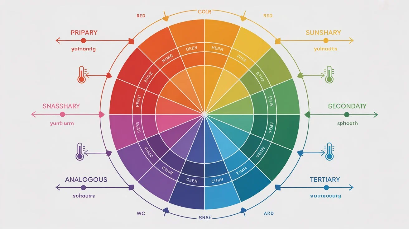
So the colour wheel. You’ve probably seen one before. It’s this circle thing with all the colours arranged around it. Not just pretty to look at – it actually shows you how colours connect to each other. We use it to figure out which colours play nice together and what kind of feeling they give off.
Some guy named Isaac Newton made the first one back in the 1600s. Same basic setup we still use. You start with three colours you can’t make by mixing – red, yellow, blue. Those are your primaries. Mix two primaries? You get purple, green, or orange. Mix a primary with one of those? Now you’re getting stuff like blue-green or red-orange.
Here’s a handy thing – one side of the wheel is warm, the other’s cool. Warm stuff like red and orange and yellow feels energetic. Like fire or sunshine. Cool stuff like blue and green and purple feels chill. Relaxed. When you’re starting a design, thinking about warm versus cool helps you nail the mood right away.
RGB vs CMYK: Colour Spaces Explained
This trips everyone up at first. Don’t worry about it.
RGB is for screens. Red, green, blue. Your phone, your laptop, digital billboards – all RGB. It’s about light. More light means brighter colours. Mix all three at full blast and you get white. Pretty straightforward.
CMYK is for printing stuff. Cyan, magenta, yellow, black. Anything you can hold in your hand uses this. It works backwards from RGB. You’re putting ink on white paper. More ink means darker. All the inks together make black. Well, almost black. That’s why there’s that extra K for black.
Want to know something annoying? Your screen lies to you. Those colours look amazing on your monitor, right? Bright and punchy? Print that same file and it’ll look flatter. Always does. Even when you set everything up right, printed colours come out less vibrant than what you see on screen. Been burned by this myself more times than I can count. Just know it’s coming.
Colour Qualities: Hue, Saturation, and Value
Three words you need to know: hue, saturation, value.
Hue is the easiest. It’s just the colour itself. Red. Blue. Green. That’s it.
Saturation is how strong the colour is. Really saturated? Bright and bold. Low saturation? Washed out and soft. Turn saturation all the way down and you basically get gray.
Value is light versus dark. Take any colour and add black – now it’s darker, that’s a shade. Add white instead – lighter, that’s a tint. Mix in some gray – that’s a tone, lands somewhere in the middle.
Colour Harmonies and Combinations
Some colour combos just work. There’s actually logic to it. Here’s what you’ll use all the time.
Complementary – pick two colours across from each other on the wheel. Red and green. Purple and yellow. Maximum contrast. Really grabs attention. Doesn’t have to be the super bright versions either. Muted complementary colours look great too.
Split complementary – take one colour as your main. Instead of using the one straight across, grab the two sitting next to that opposite colour. Gives you contrast without being quite so in-your-face. Main colour does most of the work, those two others add some spark.
Analogous – neighbors on the wheel. Blue with blue-green with green. Super smooth. Easy on the eyes. Not a lot of drama, which sometimes is exactly what you want.
Monochromatic – one colour, different versions. Lighter, darker, in between. Looks really clean and pulled together. Hard to mess this one up.
Triadic – three colours equally spaced around the wheel. Draw lines between them, you get a triangle. Good balance, still plenty of colour variety.
Tetradic – four colours, two complementary pairs. Can get messy if you’re not careful. Usually works best when you let one colour be the star and the others just support it.
These aren’t laws or anything. More like recipes. Once you get why they work, mess with them however you want.
Next up is colour psychology – basically how colours make people feel about your design. That’s where it gets really useful.
Colour Psychology in Design
Colour psychology is seriously powerful stuff. The colours you pick can completely change how someone feels about a brand or design. We already talked about warm colours feeling energetic and cool colours feeling calm – but every colour on that wheel affects how people react to your work.
Thing is, colour perception isn’t universal. Someone’s cultural background matters. Age matters. Even gender can play a role. Colours hit different people differently based on their experiences and where they’re from.
Research shows pretty consistent emotional patterns though. Red screams power, passion, excitement – but flip that and it also means anger, danger, aggression. Blue feels trustworthy, secure, peaceful. Downside? It can come across as cold or emotionless. Unfriendly even. Green connects to health, growth, prosperity – all positive. But sometimes it reads as boring or stagnant.
When you nail your colour choices, you’re not just making things look nice. You’re actually communicating feelings and ideas without using a single word.
Maybe you learned about the colour wheel in school at some point. Probably seemed pointless then. But getting comfortable with it opens up endless combinations. Sometimes colour becomes the main event in your design – everything else just supports it.
Alright, colour theory covered. Time to tackle typography, which might be even more important.
Typography Fundamentals

Typography is how you arrange text so it’s readable, clear, and looks good. Sounds simple. It’s not.
The Evolution of Typography
Typography goes way back. We can trace it to ancient Rome where they carved capital letters into monuments and buildings. The chisel marks left these little feet at the bottom of each letter stroke – that’s where serifs come from.
Fast forward to the 14th century. Gutenberg brings out his movable type printing press. Game changer. Now you could print tons of pages with ink instead of copying everything by hand. Gutenberg created the first real typeface – Blackletter. Pretty, but nobody could read it easily. So Roman-style typefaces took over instead because they were clearer.
Printers started getting creative with spacing to fit more text on pages and save money. That’s where tracking and leading came from – just practical solutions to cut costs.
Industrial Revolution hits. Printing technology explodes. Suddenly there’s all this advertising to design. Newspapers. Posters. Designers went wild experimenting with condensed fonts and stretched fonts. Out of all that chaos came slab serif typefaces – thick, bold, punchy. They still give designs that vintage, old-timey vibe when you use them for headlines today.
1900s roll around and modernism takes over. This is when we got classics like Futura, Gill Sans, Helvetica. Clean, functional, super easy to read. No frills. Just clarity.
Then computers happened. Now anyone can design typefaces with software. The variety available today is insane. And the newest thing? Variable fonts. One font file that adjusts weight, width, style, size – all flexible. Pretty wild when you think about it.
Before we get into different type categories, you need to know type anatomy. Otherwise explaining the differences between typefaces won’t make much sense. Plus it helps when you’re actually setting type in your designs.
Essential Type Anatomy Terms
Alright, type anatomy. Sounds fancy, but these are just the names for different parts of letters.
Serif – those little feet at the bottom of letter strokes. We talked about how they came from chisel marks on Roman stone carvings. Serifs make long text easier to read, which is why you see them in books and articles a lot.
Ascender – any part of a lowercase letter that sticks up above the normal height. Think about letters like b, d, or h. That tall part going up? That’s an ascender.
Descender – opposite problem. Parts of lowercase letters that drop below the line. Letters like g, j, p, q. That tail going down is the descender.
Axis – the angle or direction of the strokes in a letter. Basically how the letter would look if you drew it with a calligraphy pen at an angle.
Ear – that little decorative stroke on the upper right of a lowercase g. Called an ear because, well, it kind of looks like one.
Bowl – the round, enclosed part of letters. The circle in an o or d or b. That curved space is the bowl.
Shoulder – the curved part on letters like r, m, or n. Named after human shoulders because it looks similar.
Stem – the main vertical line in a letter. Usually the biggest, most obvious stroke.
Spine – that curvy line running through an uppercase or lowercase s. Can be pretty vertical or more horizontal depending on the font.
Ligatures – when two letters connect into one character. Some letter combos crash into each other when printed, so ligatures smooth that out. Like when f and i connect.
Lowercase – the small letters. Not capitals.
Uppercase – capitals. Called that because back when type was physical metal pieces, printers kept the capital letters in the upper drawers of their type cases. Lowercase letters went in the lower drawers. Makes sense.
Understanding Font Styles and Weights
Font style is stuff like italics or ALL CAPS. Simple adjustments to how the letters look. Some fonts only come in one style – just regular. Others give you tons of options.
Weight is how thick the strokes are. Most fonts have regular and bold. But some go from super thin all the way to extra heavy. Variable fonts take this even further – you can adjust weight to basically any thickness you want. No limits.
Graphic Designing Courses in Karachi
Knowing your typeface categories helps you pick the right font and understand design history. Let’s break down the main ones.
Graphic Design Courses Fees and Type Classifications
Sans Serif – “sans” is French for “without.” So sans serif literally means without serifs. No little feet. These are super versatile. Work great for headlines or body text. Clean, minimal, modern.
There are subcategories here. Grotesque sans serifs got popular in the 1900s. Slight variation between thick and thin strokes. Some letters have open gaps. Neo-Grotesque came later – more refined, more neutral. Uniform strokes, closed gaps. Think Helvetica. Humanist sans serifs borrow from Roman letterforms. Some characters have that handwritten, calligraphic feel. More contrast in the strokes. Geometric sans serifs are built from circles and rectangles. Very uniform. No contrast. Straight up and down.
Graphic Designing Course in Pakistan
Serif – those fonts with the little feet we keep mentioning. Great for body text because they’re easy on the eyes for long reading.
Serifs split into groups too. Old style serifs came from the 15th to 18th centuries when metal type was new. Rounded, angled serifs. Transitional serifs showed up in the 18th century as printing got better. Sharper serifs. Modern serifs are super refined with perfectly flat, straight serifs. Look fashionable but can be harder to read. Slab serifs are chunky and bold with thick, square serifs. Same stroke weight throughout. You see these in old Western posters and vintage ads from the 1800s.
Scope of Graphic Designing in Pakistan
Script – fonts that mimic handwriting. Two main types. Formal scripts look elegant and fancy – wedding invitations, diplomas, that kind of thing. Based on 17th and 18th century handwriting with lots of flourishes. Casual scripts feel more relaxed and friendly. Think brush lettering from the 1900s.
Monospaced – every letter takes up the exact same width. Looks like a typewriter or computer code. Great when you want that minimal, technical, undesigned aesthetic.
Display fonts – the catch-all category for everything weird and experimental. Graffiti fonts, tattoo fonts, fantasy fonts, whatever. Not meant for body text. Just headlines and special stuff.
Variable fonts – not really a style, more of a file format. One font file that can morph between thousands of variations – different weights, widths, slants. Google, Apple, Microsoft, and Adobe developed this together. Pretty impressive tech.
Graphic Designing Courses in Lahore
Quick tip – serif and sans serif both work fine for long text. Mixing the two? Totally fine. Using more than three different fonts in one design? Usually looks messy. Keep it simple.
Envato Elements has solid fonts if you need a good library to pull from. Quality is consistently good across their collection.
FAQs
Which course is best for graphic design?
The best course depends on your goals, but a comprehensive program covering design principles, color theory, typography, and software like Adobe Creative Suite works great. Look for courses that offer hands-on projects and real-world applications. Most designers prefer courses that balance theory with practical skills.
What is the salary of a graphic designer in Karachi?
Entry-level graphic designers in Karachi typically earn between PKR 25,000 to 40,000 per month. With experience and a strong portfolio, mid-level designers can make PKR 60,000 to 100,000 monthly. Senior designers and art directors often earn upwards of PKR 150,000 or more depending on their expertise and clientele.
What are the 7 types of graphic design?
The seven main types are: visual identity design (logos, branding), marketing and advertising design, user interface design, publication design (magazines, books), packaging design, motion graphics design, and environmental design (signage, murals). Each type serves different purposes and requires specific skill sets.
Which graphic design course is best in Pakistan?
Courses from established institutes that cover Adobe Photoshop, Illustrator, InDesign, and design fundamentals are your best bet. Look for programs with experienced instructors, updated curriculum, and portfolio-building opportunities. Online platforms also offer quality courses if you prefer flexible learning schedules.
Is graphic design a good career?
Absolutely. The demand for designers keeps growing as businesses need strong visual communication across digital and print platforms. You can work in-house, freelance, or start your own agency. The creative freedom and diverse project types keep the work interesting and rewarding.
What are the 4 rules of graphic design?
The four fundamental rules are: contrast (making elements stand out), repetition (creating consistency), alignment (organizing elements), and proximity (grouping related items together). These principles work together to create clear, effective designs. Master these and you’ll have a solid foundation for any project.
What is the scope of graphic design in 2025?
The scope is expanding rapidly with digital transformation. Businesses need designers for social media content, websites, apps, branding, and marketing materials. Remote work opportunities are increasing, and freelancing platforms make it easier to work with international clients. The field continues evolving with new technologies and platforms.
Is graphic design a stressful job?
It can be, especially with tight deadlines and demanding clients. Managing multiple projects and handling revisions requires patience and good time management. However, many designers find the creative problem-solving aspect fulfilling enough to balance the stress. Freelancing gives you more control over workload and schedule.